Saturday, August 13, 2011
Art critique
I reviewed the project by Lauren McGowan entitled "A world's war". I chose this exhibit because the theme of war interested me and I wanted to see how she decided to go about interpreting and portraying it through art. I was challenged by trying to organize all my thoughts about her choices individually and as a whole, in regards to this exhibit. It was hard knowing how much detail was too much, and how objective vs. subjective I should be. I generally feel uncomfortable critiquing other classmate's works because I know how hard it can be to do projects like these for classes and even if something doesn't seem "good" to me, that person may have 3 other classes they are trying to work on, or perhaps it was simple their best effort. I would enjoy reading the critiques about my project, I think. However, I am sensitive, so if they were harsh it would be hard for me to stomach. I would rate my article as a 10 because I know I did the best I could do with it and tried to be as honest, yet professional about it as possible. I would not necessarily say I enjoyed this project, but it wasn't the worst one I have done, either.
Thursday, August 11, 2011
reflection on aed200
1. What were you expectations for this course and where they met?
Orginially, I expected to learn about different types of art and origins, etc. I feel that this class has met those expectations.
2. Now that you've been through this course, What is art? How would you define it now compared to your intial posting?
Art is a variety of expressions of an individual. Art can be painting, photography, video, architecture, installations, and more. I think I would be much more broad in my description of art now. I didn't realize it encompassed so much.
3. Who was your favorite artist in your original posting and who is your favorite visual artist now? If there is a difference, why do you think so? If you have the same favorite artist, why do you think so?
My favorite artist orginally was Dalí. I still feel that he is my favorite artist after taking this course, although I have been exposed to many more artists that I am very impressed by. I think I have the same artist as my favorite because I am very moved by his work above the rest.
4. Now that you've completed this course, how do you feel about taking an online course? Is your answer the same as it was in your first posting? How is it the same or different?
I think that taking an online course is great. My answer has not changed. I think it offers flexibility and allows a person to still work/have a life outside of school. Thank God this is my last class forever, though! :)
Video review week 11
An Introduction to the Italian Renaissance (Giorgio Vasari)
This video was quite interesting to me. I learned a good amount.
Vasari wrote, “Lives of the Artist’s”, and it acted as a culmination of famous artists and their work throughout the years. By doing this, it allowed new artists to learn from previous artists that had already mastered many different styles of art. During this time, barbarians destroyed a lot of artwork, which made it necessary to document paintings and sculptures in order to keep track.
The artist Giotto used landscaping and architecture to add depth to his paintings.
Older works of art also were an influence on Giberti. As a result, he was able to reproduce the human figure very accurately.
The very famous Da Vinci added science and math when creating his art. He needed to see things from the inside out in order to recreate them. The human form needed to appear naturally in the surroundings.
Raffaello made sure his painting were never too crowded or lopsided. He used balance to be sure of this. Lastly, Michaelangelo taught himself at 14 how to paint and sculpt by studying the work of others.
The Colonial Encounter: Views of Non-Western Art and Culture
This video wasn’t one of my favorites from this class. However, the following is what I learned.
The video discussed that the largest fair was in 1900 in Paris. It was to celebrate friendship.
The Dahome exhibit consisted of mud structures to portray African culture.
Later, violence eventually broke out and civilizations became fearful. The barbaric people were banned from Europe.
In the art, Dahome’s independence was shown through the portrayal of sharks. It represented determination to protect the water surrounding their land.
By the 1900s, tourism was becoming a major industry, which then led to building hotels to support travelers. Because of this, the exploitation of African men and women began taking place.
The Critics: Stories from the Inside Pages
I learned a good deal from this video. It taught me that critics give you another way of looking at things. Steven Hunter believes that through writing we are able to evoke the imagination of others. Furthermore, the main function of critics is to help the consumers get the most out of the money that they spend.
Because of critics, authors, directors, artists, and actors have to do their best possible because they know that they are being rated in the media for millions to see. The video also discussed that book critics are the most influential in their ability to help out new writers.
This can breed subjective criticism.
When reading a critics review, there is no real way to say that they are 100% accurate.
Criticism should be constructive, no matter if good or bad. It is important to use criticism personally in order to grow and better ourselves and our work. When criticism others’ work, we must take into consideration that it is for the purpose they better themselves and their work, and not to make it too personal.
I thought the films were informative and mostly interesting. I liked the video called “Stories from Inside Page”. The video I didn’t like was “The Colonial Encounter”. It just did not interest me all that much, at least a lot less than the others.
Sunday, August 7, 2011
Art curator exhibit
The creation of my exhibit was incredible challening for me. It was mostly challenging because I have very limited time, and it was very time consuming. I did start it early, too! I thought it gave me a great appreciation for what real curators do. It is not a job I would ever chose for myself. I did however enjoy learning of the several art website available to us through Buffalo State. I started by using CAMIO, and that is all I used so as not to confuse myself. I came up with my theme of "Green" because I wanted to focus on nature. I did not intend to have trees as a recurring theme throughout it, but they ended up that way. There were some flowers, however. I think at some point, the exhibit just took on its own life form, and that is the direction it headed in. I would have enjoyed this experience more if I hadn't been so stretched for time.
Wednesday, August 3, 2011
Video review week 10
The Lowdown on Lowbrow: West Coast Pop Art
This video was interesting to me because it talked about an aspect of art I wasn’t familiar with: Lowbrow art. It is a style to that is reactionary to the highbrow culture. In the beginning stages, this art mainly depicted cars and naked women. Robert Williams was the one who coined the phrase Low Brow Art in his book published in 1979. Things that inspired this art were B rated movies, car culture, surf scene, Malibu Beach Scene, McCarthyism and the threat of Communism. Ed Roth, Von Dutch and Robert Williams are the three big artists of this style.
As far as famous museums go, there doesn't seem to be any Low Brow art in them. These artists created their own scene and put on their own art shows. Over the last ten years Low brow art has gained more recognition and acceptance, however. The growth and value of this type of art has been growing by leaps and bounds.
Displaying Modern Art: The Tate Approach
During the first it was opened, there have been 4 million visitors making it the most famous Modern Art Museum in the world. Gender, ethnicity and sexuality roles in the acceptance of artworks was looked at. Tate Modern had to come up with a different way to display art. They displayed art in four sections, each section will provide a theme for works of art. Landscape, still life, history and the nude are the themes which link directly to the genre of art from the 17th century french academy. The Tate approach does not go in chronological order and will have an abrupt transition between pieces and the artists. This type of display allows viewers to have no previous knowledge of art is also seen as a form of entertainment. The exhibits are set up so that people will not get bored. The pieces mean to compliment each other and transition well. Hanging art thematically encourages a type of viewing that can leap out and thought of less as a narrative. The idea is to avoid having to be too distracted and concentrating too much on what is being viewed.
Bones of Contention: Native American Archeology
During the US genocide against Native Americans over the past 150 years, their bones have been collected and Anthropologists have tried to figure out whether or not these bones should be returned to the Native Americans. Roadwork in Iowa disturbed a cemetery, and 26 Anglo people were later re-buried but one Native American and her baby were sent back for study. Because of discrimination, Iowa ended up passing a law protecting Native American remains remains. Such groups of people as the Europeans encountered burial mounds, and then collected the remains but afterward they thought the mound builders were too intelligent to be Native Americans. In all, over 4000 skulls of Native Americans were collected. One woman Susan Harjo fought for the Native peoples objects to be returned to them. The Smithsonian has held the bones of 18,000 Native Americans, also. IN 1989, inventories were taken in the museums and they were told that the remains must be given back to those tribes. Scientists tired to document all the remains before they were given back to the tribes for re-burial. Now burial sites remain untouched and are avoided by construction crews at all costs.
George Eastman House: Picture Perfect
George Eastman was considered to be the father of Photography. He was described as a visionary and also as marketing genius. He was actually the inventor of motion picture film. His house has since been turned into a museum. Eastman created a process that made photography available to everyone. His Brownie camera revolutionized photography, also. The Brownie was made for 70 years. The Tech collection in the Eastman house contains around 16,000 objects, of which 5,000 are cameras. He strove to make the camera as convenient as possible. Kodak became one of the best known brands all over the world and an interesting fact is that he just made the name up. In 1996 the Eastman House established the first school to teach the restoration, preservation, and archiving of motion pictures. The Eastman collection can also be viewed online now. In the end, Mr. Eastman took his own life because he didn't want his disease to be his demise, he wanted to control his life and death.
I really enjoyed the Low Brow and George Eastman videos. I never knew much about either of these topics previous to the videos. The Tate Museum is very interesting also. I thought it was interesting that the creators wanted art to just be enjoyed for what it is, and now as if it were a chronological history book. The least interesting to me was the video about the Native Americans because it just is not a topic that peaks my interest.
Saturday, July 30, 2011
Video Reviews week 9
Andy Warhol: Images of an Image
I chose this video because I am familiar with Andy Warhol’s name but not really with his work. I thought this was a good time to learn more.
In the video, Andy Warhol’s life is described. He worked as a commercial artist until 1960 when he began experimenting with advertising images. He worked up til he died in 1987. Andy Warhol's interest in the lives of famous women inspired several repeated images. For example, photographs are blown up and developed onto silk screens. After, they are transferred to paper and canvas, using ink/paint. Andy Warhol saw the repeated silk-screen images as a way to make money. Warhol produced dozens of self-portraits. As an art journalist his work addresses race riots, the conquest of the moon, the Cultural Revolution in China, and the universal reign of the dollar. I thought this video related to the reading in that some of the processes mentioned, and also Warhol, were discussed in both.
I learned from this video that Warhol used film (photography and movies) to express himself artfully.
Art Expressionism:
I chose this video because I think it is interesting how so many people may have different ways of expressing themselves through art. I thought perhaps this video would touch on that.
In the video, it uses Franz Kline's painting "C&O," which is abstract art, to be compared to figurative art. Kline initially injects his work with mood and expression but moves towards painting colors in undefined space. In this way, he ignites the imagination with an impact that can be labeled as sensual. He uses shapes to evoke emotions. Kline's use of action painting reveals a process of constant discovery and leads us into a world of color and form. Another artist, Frankenthaler, has done work that is both feminine and mystical at the same time. "Morning: The Springs" expresses movement as an echo of sensations and is full of plant forms, light, and falling water. It is a momentary gift of light with a calligraphic quality. De Koonig is another artist that is mentioned in the video. Warhol is mentioned in this video as well, along with Rauschenber, and both become art icons of the 60s by paving the way for pop artists in their use of everyday objects.
This video related to the readings in that it referenced artists that were also discussed in the book and discussed the techniques these artists used (in both) and how they evoke emotion.
I thought this video was interesting, although the amount of information I felt a bit overwhelmed by. I enjoyed learning about it though.
Extension request granted for this.
week 9 video review
The Impact of Cubism:
I chose this video because I find cubism a very interesting form of art, and of course, the influence of Pablo Picasso, a Spanish painter, is something I am acquainted with.
Cubism is a form of art that is influenced mainly by the works of Cézanne, African tribal art, and the art of the Iberian peninsula. It was highly influential during the early 20th century. It was a new way to represent time and space. One of cubisms artists, Gris, uses spiritual elements and imagination. He starts with abstraction and ends with the real object. Gris also uses a collage as a tribute to the austerity of the Spanish tradition. Duchamp's work is compared to stop photography. Robert Delaunay combines several points of view, nontraditional laws of perspective, elements of time and memory to reveal the Eiffel Tower as a confused, exciting statement about life. I thought this video was related to the reading in that it focused on some of the same artists that were also in the book. I learned a lot about other cubism artists other than Picasso from this video. I was not well aware of the others prior to the video.
Matisse and Picasso:
I chose this video because I am very interested in the works of Picasso and did not know anything about Matisse so I thought this would be a good opportunity to learn.
Picasso and Matisse were both known to have stood against tradition. Gertrude Stein was the first to recognize the greatness of Matisse (1905) and Picasso. In his works, Matisse is deliberate, rational, and his French roots show in the way he organizes his thoughts. Picasso is a worker, impulsive, and one can see how he immerses his heart and soul in his paintings. From this video, it seemed that Matisse was much more organized and methodical than Picasso. Picasso seemed to paint by his whims and in a state of “semi-consciousness” at night, while Matisse chose to paint by the clock regularly. This video related to the reading in the book in that both focused on these artists style (cubism) as well as they themselves.
I enjoyed this video a lot because of how thoroughly it described both Picasso and Matisse’s lives and styles of art.
Friday, July 15, 2011
2nd art visit


The first work of art shown is called Mynd from 2002. It is a 6-channel projection displayed on 6 contigous, vertically oriented panels of wall. The video itself was various scenes from nature, like waterfalls, animals in slow motion, rocks falling, etc. I think this is a representation of raw life. It shows continuity, motion, and energy. I think the artist was trying to show how much raw beauty exists in nature, that we don’t necessarily need to “Create” the art in nature, but rather admire it.
The second piece of art was called Bent Scans, from 2002. It is a constantly moving and evolving video projection that appears to be computer generated (and it is). There were two projections going on 2 different adjacent walls. This honestly reminds me of those screen savers that pop up on computers or sometimes TVs when not in use. I am not really sure what she was trying to say with this creation, perhaps that there is so much variety in life and it all is happening simultaneously. The third piece of art was called Tokyo Four, from 2002 also. This installation had 4 projectors set up on the same wall, projection various images that seemed to “swallow” into themselves, and turn into another image. The entire exhibit was animated by soundtracks that sounded incredibly creepy and eery, and it was upon seeing this part that I realized how perfectly the music actually fit with the display. This art piece honestly disturbed me. It reminded me of a horror movie. I think the artist’s resounding theme throughout the exhibit, and definitely with this 3rd piece, was that life is continouous and that media is part of that fast paced, ever-changing environment we live in.
Thursday, July 14, 2011
Hand drawings

I thought the idea of using my hands as subjects for drawings was a good idea. I liked it because it was something that (obviously) I had right there with me and didn't have to go find. I used pencil to draw with since that is what I had available to use. It was a challenge trying to use my left hand (non dominant) to draw with. As you can see, it was not very successful. Actually, neither attempts were very good. But the left handed one is definitely worse. I think they are not realistic representations of my hands, but I am not really very good at realistic drawings. I would consider using my left hand again to draw or even paint with if I were trying to go for an abstract feel to the art.
4 Video Reviews
Velasquez:
I chose this video because my major is Spanish Ed. And naturally, the video about the Spaniard Velasquez interested me.
Some key concepts addressed in the video are that he was born in Seville, Spain in 1599. He was the court painter. He died in 1616. He served the palace in many ways and he was considered nobility. He captured moments of life in his paintings. He represents “Artlessness”, nature, and organic-ness. This video relates to the reading in that both the book and video discuss his works. His paintings were pictures of reality. He painted as part of the Baroque era. I thought this film was interesting, although it was a bit slow moving. It showed many of his works of art which interested me a lot. It was a nice opportunity to see his works all in one place at one time.
El Greco: Rediscovering a Master
I chose this video because of my Spanish Ed. Background and also because I am Greek. El Greco learned how to paint from masters like Tintoretto in Italy, but mainly was self-taught. At 37 years old, El Greco came to Spain. He is considered one of the greatest Spanish painters of all time. He received contracts to paint for the royal families. El Greco was considered a Mannerist, as far as his artistic style goes, and the book discussed this as well. He painted icons and religious themes in a typical Italian style, also. I enjoyed this film about El Greco. I have done several research projects on him and his works and I thought this video was very thorough. I always enjoy learning more about him.
Leonardo DiVinci: The Mind of the Renaissance:
I chose this video because although DiVinci is incredibly famous, I actually don’t know too much about him/his life. Key concepts I learned from the video are that DiVinci was born in Tuscany. DiVinci became fascinated with the human form/body. He observed gestures, movements, and details that he called “motions of the soul”. He was considered the “Renaissance Man”. He has an internal desire to undestand things, especially their make up and how they worked. DiVinci was amazingly talented in sculptures, paintings, and architecture. This video relates to the readings because both described his life and talent and works. This video was interesting but was slow moving in my opinion. It was hard for me to pay attention, honestly. I did enjoy seeing all the works by DiVinci.
The Night Watch: Rembrandt
I chose this video because I know very little about Rembrandt. The video discusses the great icon of Dutch art, “The Night Watch”. It is 11x14ft, very complex and intriguing. It is both a military scene, but also cryptic because a little girl Is present and also a small dog. Rembrandt wanted the painting to be more than just a portrait. The men in the painting were aristocrats who paid hefty sums to be included in the painting. The painting shows his ambition and is filled with action and emotion. It captures that moment in time, so to say.
This video relates to the book in that both describe his relation to the Baroque style. The book also decribes his “The Night Watch” painting, as well as the video (which focuses solely on it). I thought this video was interesting in the fact that it focused in just one work by Rembrandt. I never had heard of it before, and therefore learned a lot from this video.
Friday, July 8, 2011
Video Reviews
More human than human:
This video was chosen because it was required. Some key concepts I learned from the video is that no other image dominates our lives more than that of the human body. I also learned that in the past, certain features are underemphasized and others are overemphasized. This demonstrates the values of the culture at that time. Other culture's depicted bodies in the way they wanted their people to be; perfectly proportioned. The video relates to the reading in that it focuses on the Egyptian culture's depiction of human form, as well as the swollen bodies of female figures with emphasis on bellies, breasts, and hips (pointing to the importance of child-bearing). I think this film is really interesting because I never thought about how much we as humans focus on our bodies, and the bodies of others. It is an image that is pervasive in our world, past and present. I think it related well with the readings, too.
Greek art and the human figure:
I chose this video because Greek history interests me, being that I myself am Greek. Some key concepts I learned was that the Greeks had an obsession with perfecting the human form as well as portraying it in a realistic way. They also had obsession of the nobility of the form they sculpted; the artists wanted to capture something about the human condition/emotion in their art. In the 6th century, the Greeks moved on from Egyptian styles, and began to produce the human form in 3D. Basically, the Greeks sculpted “ideal forms” for human beings. This video relates to our readings in how it discusses the way the Egyptian art influenced the Greeks. They also both discuss the ideals represented in Greek sculptures. I think this film was a good supplement to the readings. I learned a bit more in depth about the messages the Greeks were trying to convey about the “perfect form” through their art.
Cairo Museum:
I chose this video because it had to do with Egypt, and I have learned through this class that the Egyptians were one of the earliest influencers of art. Some key concepts of the video were to discuss the types of artifacts inside the museum, such as 30 dynasties, 5,000 years worth of history and artifacts that are housed there. The museum is basically ran by Dr. Zahi (spelling?). The museum contains 160,000 artifacts, but only half are displayed. The rest are in their basement. This video exposed their process of going through the basement and trying to do an exhibition there. This relates to the reading because it discusses Egyptian art and artifacts and how much important history there is in it. I thought this film was insightful because of the vast amount of history and artifacts contained in the museum that the public hadn’t seen yet. I enjoyed learning about it.
Beyond the Classical: Byzantine and Later Greek Art
I chose this video because it had to do with Greek art and history, as I mentioned earlier, that is an area of interest for me. The key concepts in the video dealt with the progression of Greek history and art and how they evolved over time in Europe. Greek art typically depicted Christian themes, using icons. During the Byzantine period, the church encouraged the destruction of “secular” art. The Greek gods were not allowed to be depicted in art, only Biblical icons. Architecture was also an area in which the Greeks contributed much.
I thought the fact that there is an Icon school now in Greece was really interesting. I enjoyed the still shots of Greek buildings because they are so beautiful. The columns are so regal looking. I thought this video furthered my appreciation for the Greek culture even more.
Reviewing peer responses to artwork
http://ryana01buffalostate.blogspot.com/2011_06_01_archive.html
http://jmarch7588.blogspot.com/
I thought both the blogger's use of elements and principles of their project were well chosen. I did see other elements in some of their photos, and comment as such. Sometimes one person sees something more clearly than another, just because we all have different points of view.
There were no images that were the same as the ones I chose, because mine were from the Penny Burchfield art gallery and theirs were from the Albright Knox gallery.
4. Where there any images that your Peers selected that pique your interest now? If yes, what are they and what is your connection with them? What would you want to know about them?
One of the blogger's posted a painting called "Dangerous Curves" that i thought was beautiful. I liked it because of the abstract design and interesting use of color. I love that kind of art. I would want to know the reason behind the artist's inspiration. Also, another painting was posted by both bloggers called "Carcass of Beef" which was an intense depicting of exactly what the name says. It was in the shape of a human heart.
I think reading my peer's reflections was nice way to expose myself to other art that I wouldn't have otherwise seen. It was useful in seeing all the different interpretations of art that people can have.
I thought the comments from my peers were helpful and constructive. I think although some people said they didn't agree with my choice of element/principle for certain photos, I still think I chose it correctly simply because every person interprets something differently.
Sunday, July 3, 2011
Video Review- architecure
Prairie Style:
From watching this video, I learned that the prairie style was developed by Frank Llyod Wright. Its design is centered on that fact that the houses represented the flat landscapes of the Midwest, where Wright first started his design. It changed the face of modern architecture. He used a lot of horizontal bands, layering them to create the look that that they are “growing out of the land”. The main components of the design is centered on large open spaces, connecting rooms, as well as elevated living rooms and large windows for viewing outwards. Wright's design was centered on the idea that the house becoming a part of its surrounding environment, and it should not take away from the site. It depicted the organic relationship between the home and its surroundings.
This video relates to the text because they both discuss the influence, and concepts of Wright's design, and his desire to make sure that the house blended in to it's surrounding environment. He wanted to “Echo” the designs of the prairies on which the houses were built.
I thought this video was interesting because it described the basic components of Wright's concepts and principles, and it also showed how his influence on future generations of architects has continued. I also personally liked how he wanted the front doors to have to be “accessed”, for example, were not just stuck right in the middle of the house’s front. I chose this film because it called my attention. I have heard Frank Lloyd Wright’s name often, but have never actually explored any of his work and found myself pleasantly surprised by how much I liked it.
Last Call for Planet Earth:
This video explained how the ideas of sustainability are being used in construction, as well as in restoration of old buildings to ensure that they are being built with renewable resources, and that they maximize their natural ability to heat and cool large spaces. The idea is to not rely on outside energy sources in order to maximize their efficiency as well as reduce carbon emissions. The video also explores alternative energy methods, such as solar energy. This is an important part of increasing buildings’ efficiency. Natural resources like water and wind also are being used for energy purposes effectively. The designs of the architects in the video were created to maximize their surrounding environment, and help large building structures reduce the amounts of energy used and waste created. The architects used recycled materials/sustainable products like wood, instead of metal and steel.
The video relates to the text because it describes the basic principles of green design. They discuss how sustainable materials are important and why. They also discuss how design is centered around using natural elements to create light, as well as how design incorporates the elements to provide heating and cooling naturally.
I thought this video was interesting because it focused on large green developments, and highlighted how simple changes can make a huge difference in how a building affects the environment. I chose this video because the concept of “Green” living isn’t something I personally having incorporated much in my life, but I think it really is important to be informed about.
Video Reviews-WEEK 5
Eyes of a Sculptor:
I learned that it is rare that during restoration of a piece that a sculptor will actually work on statues, outside of perhaps working on extremities such as feet and hands. The sculptor also described the fact that he used blocks of marble that weighed as much as 40 tons. He considers things like how resistant it will be, how durable, etc. I also did not know that most sculptures are not worked on entirely by the same artist. Several artists will work on the piece, and each one specializes in certain areas. Their work contributes to the whole.
This video relates to the text in that it gives more insight into the sculpting methods, the processes the sculptor goes through, their thoughts/ideas, all of which are mentioned in the book.
I thought this video was very informative. It shows how the process of creating a sculptor, from that start to finish. I think it was very interesting how much thought has to go into just the choice of the marble, for example. It’s not as simple as I previously though.
Glass and Ceramics:
The video showed the process of how glass is created, and described the benefits of the use of glass as a building material. The video also shows how glass is shaped through various ways, such as through using propane torches, or using chemical agents like hydrochloric acid. It is so interesting how something like glass actually turns into a sticky, runny texture when heated and that’s how they shape it. The process of creating stained-glass windows was also interesting to see, especially how there are many steps that go into it, like the sketches they make prior to cutting the glass, etc.
I also learned about the processes in making ceramics, such as dry pressing, which is a commonly used practice when producing flat objects, such as dinner plates.
This video relates to the text because it shows the process of stained glass creation, namely lead-stained glass, which is mentioned in the text. The video also gives more details about the process of how glass is created. The process of firing clay to enhance durability is mentioned in both the text and video as well.
I thought the video was informative because it showed how glass is actually made. It was also interesting to learn the many uses of ceramics, like for bone replacements, and car parts, etc. I never knew how adaptable ceramics were prior to watching the video.
Installation Art:
The video described the history of installation art, and explained how it has challenged the traditional view of what art means. It discusses the importance of the site for which an installation is created, and the affect this has on what the installation is. Installations have become a modern, trendy and fresh way of expressing oneself through art.
This video relates to the text because they both discuss Installation Art, which is the relationship of the piece with the viewer and it's time and place. The video also uses Smithson's "Spiral Jetty" as a reference to explain how installations relate to their specifics sites where they are placed.
I thought the video was interesting and helped me understand more about installations. I never considered them as art prior to this class, and frankly didn’t really know they were become so popular. I think installations are a really neat way to express an idea in art.
Tuesday, June 28, 2011
Art Gallery Visit- Extension request granted
For my first art gallery visit, I went to the Burchfield Penney Art Gallery next to Buffalo State. I would have gone to the Albright Knox, but they were closed on my only available day to go. I did not think I would much enjoy the visit, and found myself very surprised. The artwork I will be posting was very beautiful to me, as was the rest that I saw. I could not believe the incredible attention to detail that I came across. One piece that made an impression on me was by Carolyn Panzica from 2010. It was sugar string work over a sugar covered based. It was "Untitled". It was absolutely beautiful! It impressed me because it reminded me of a small wedding cake and was approximately 2 1/2 feet high in an enclosed glass case. The details, the symmetry, the sheer design: all beautiful. Another piece of art that impacted me was by Fotini Renzoni titled "Conspiracy" from 2010. It was graphite on claybord. Just like the sugar piece, the attention to detail was astounding. I will post an up close picture to give you an idea of how painstakingly the artist drew. The plaque next to the piece said for every square inch, it took 2 hours of work. I would estimate it probably took the artist 4-5 months of work to complete it. Another piece that impacted me was by John Tracey in 2007 called "Untitled" and it was fired stoneware clay, oil based paint, and graphite. It looked like a sculpture and a piece of something in nature both at the same time. It had beautiful symmetry, yet it was sort of unbalanced. It was about 3 feet high and 2 feet in diameter.
Some of the art I felt connect to was two other pieces by Carolyn Panzica. One was called "Untitled" from 2007 and was sugar string work over sugar covered base. This also looked like a cake, about 3 feet high, and it had a lovely half dome on the top. What i related to was the bright colors. I LOVED the colors. There was so much texture, too! I just felt like it was something i could see myself trying to create. Her other piece, also "Untitled" from 2010 was also sugar string work over sugar covered base. This resembled a sheet cake, it was maybe 3x3 feet. The colors were in half squares over the top, and again this is what struck me. I love bright colors. The 3rd piece of art I felt connected to was by Felice Koenig called "I glow for you" from 2010. It was acrylic on canvas. It was about 5x5 feet. It was AMAZING. I took a close look and could literally see layers upon layers of acrylic "droplets" of all different colors of paint, mainly oranges and reds. I cannot imagine how long this must have taken to make. I related to the colors, and also the complexity of it. I am a complex person, and it just seemed like if I were a piece of art, maybe that would be me.
The three pieces of art I would like to know more about were different that the rest. One was by Katherine Sehr called "Untitled" from 2007 and was ink on paper. This piece was huge, maybe 6 feet by 5 feet. Standing far back, it just looked like a grey large rectangle but up close, the details were SO intricate. I would like to know how she made this, through stamping or but drawing by hand. I also want to know what prompted her to make it. Another piece was by Jozef Bajus from 2010 called "Object MC-12", which was paper, cotton thread, taped, and mixed media. This to me looked like an oddly shaped book. I read on a plaque that he made it achordion-like so that the gallery could decide how they wanted to display it. I'd like to know how he got the idea to used paper to "weave" like material. Also, if this was the result of one attempt or several hundred attempts. The last piece that interested me was by Carylon Panzica called "Untitled" from 2011, using the sugar string on sugar base. This was like a sheet cake and I wanted to know why all her work seems to resemble cakes and if that is on purpose. Perhaps she used to be a pastry chef? The pattern on the cake itself had an almost "Religious" feel to it, since it looked like something that could be on stained glass church windows. I'd like to know what her inspiration was for it.
Below are the pictures of the art referred to above.


 This above one is a close up of the graphit to show the details.


 This above is a close up of the ink on paper to show the details.


Some of the art I felt connect to was two other pieces by Carolyn Panzica. One was called "Untitled" from 2007 and was sugar string work over sugar covered base. This also looked like a cake, about 3 feet high, and it had a lovely half dome on the top. What i related to was the bright colors. I LOVED the colors. There was so much texture, too! I just felt like it was something i could see myself trying to create. Her other piece, also "Untitled" from 2010 was also sugar string work over sugar covered base. This resembled a sheet cake, it was maybe 3x3 feet. The colors were in half squares over the top, and again this is what struck me. I love bright colors. The 3rd piece of art I felt connected to was by Felice Koenig called "I glow for you" from 2010. It was acrylic on canvas. It was about 5x5 feet. It was AMAZING. I took a close look and could literally see layers upon layers of acrylic "droplets" of all different colors of paint, mainly oranges and reds. I cannot imagine how long this must have taken to make. I related to the colors, and also the complexity of it. I am a complex person, and it just seemed like if I were a piece of art, maybe that would be me.
The three pieces of art I would like to know more about were different that the rest. One was by Katherine Sehr called "Untitled" from 2007 and was ink on paper. This piece was huge, maybe 6 feet by 5 feet. Standing far back, it just looked like a grey large rectangle but up close, the details were SO intricate. I would like to know how she made this, through stamping or but drawing by hand. I also want to know what prompted her to make it. Another piece was by Jozef Bajus from 2010 called "Object MC-12", which was paper, cotton thread, taped, and mixed media. This to me looked like an oddly shaped book. I read on a plaque that he made it achordion-like so that the gallery could decide how they wanted to display it. I'd like to know how he got the idea to used paper to "weave" like material. Also, if this was the result of one attempt or several hundred attempts. The last piece that interested me was by Carylon Panzica called "Untitled" from 2011, using the sugar string on sugar base. This was like a sheet cake and I wanted to know why all her work seems to resemble cakes and if that is on purpose. Perhaps she used to be a pastry chef? The pattern on the cake itself had an almost "Religious" feel to it, since it looked like something that could be on stained glass church windows. I'd like to know what her inspiration was for it.
Below are the pictures of the art referred to above.


Monday, June 27, 2011
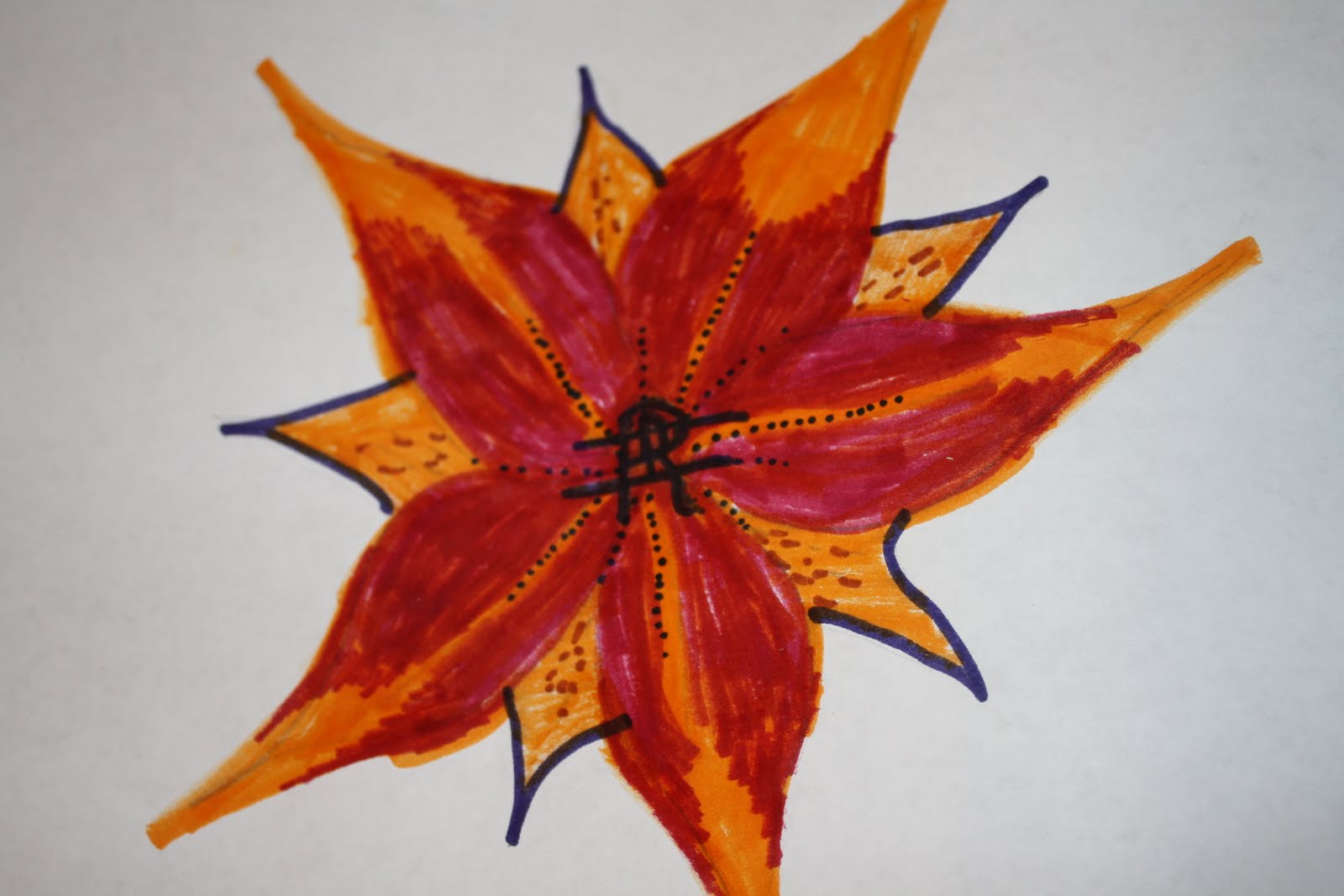
Logo Design-extension request granted for this
I felt that creating my own logo was an interesting way to help understand firsthand the creative graphic design process. I immediately knew I would want to draw something girly and brightly colored. I also love tiger lilies, so I incorporated that into the logo. Then, I figured since it was for me and representing me, I should put my initials in the logo, but not in an obvious way. In the center of the flower, i first drew a tiny "D", then I drew a larger "R" sort of on top of the "D". Then, I drew a sideways "H" that strikes through the first two letters. The most important discovery I made in creating the logo was that it isn't just a one shot deal. You need to think, create, re-do, and re-create until you are happy with the final product.The most important information I learned from the videos and information used for this project was how much attention to detail is given when creating logos. It seems like every little color, line, symbol, etc. has a particular purpose. It makes sense, because companies count in such things to make them money! My opinion of the videos is that they were very informative and gave a really nice "behind the scenes" kind of look into a graphic designer's work and mind.


 I hope you enjoy the pictures of my sketches and final logo design!


Saturday, June 11, 2011
Color
Through the videos, I learned that Color can be described as a function of light, which is an outcome of sunlight rays broken up, and refracted. Color is one of the most pleasurable of the visual elements, because of the fact that it has the power to touch our emotions and it ignites a wide range of responses, both psychological and physiological. Color can be symbolic as well as meaningful. Artists use color for various reason and to convey a wide variety or emotions and messages. Color can be striking or passive. Color can be used vibrantly, or very subtly. Either way, it is always meaningful. A most intriguing aspect about color is that color can be used to play on not only emotions, but feelings, and appetites for example. One artist, Mark Rothko, was famous for using color in some of his pieces to purposely decrease the appetite of diners, and make chefs in the kitchen feel trapped. He used certain colors such as reds and dark blues to his advantage. It is so interesting how color has this type of impact. I, for one, LOVE color. The brighter the better, in my book. This is because bright colors make me happier, I think. I am a very social, happy person and pale, soft, pastel tones just don't mix well with my personality.
The effect color has on emotion makes quite a big impact not only on the viewers, but more importantly on the artist. While watching the "Color" video, I was able to follow along with the featured artists process of a painting, and observe her strengths and struggles, which were surrounded mainly around color. I love to paint, and I understand that sometimes I am looking to create a certain "feel" behind what I am creating. The color has a LOT to do with that. For example, if I want a focal piece, I want bright, bold, and enticing colors. The artist in the video worked from her imagination to recreate the colors she observed in Venice. It took a while for her to be satisfied. After watching the video "Feelings" video, it only reinforced what I already feel within myself when I wear or am surrounded by certain colors. It makes sense why certain artists used black and white to paint pictures of horrors or sadness, and why other artists used bright colors to portray beauty and serenity.
The effect color has on emotion makes quite a big impact not only on the viewers, but more importantly on the artist. While watching the "Color" video, I was able to follow along with the featured artists process of a painting, and observe her strengths and struggles, which were surrounded mainly around color. I love to paint, and I understand that sometimes I am looking to create a certain "feel" behind what I am creating. The color has a LOT to do with that. For example, if I want a focal piece, I want bright, bold, and enticing colors. The artist in the video worked from her imagination to recreate the colors she observed in Venice. It took a while for her to be satisfied. After watching the video "Feelings" video, it only reinforced what I already feel within myself when I wear or am surrounded by certain colors. It makes sense why certain artists used black and white to paint pictures of horrors or sadness, and why other artists used bright colors to portray beauty and serenity.
Creative Process of creating Element and Principle Slideshow
I personally love photography. My husband and I purchased a Canon Rebel about 1 year ago and love to use it to capture life's moments just that much clearer. I enjoyed creating this slideshow because it allowed me to use my creative side as well as the camera I love. Some of my favorite shots are the ones of the flowers, that demonstrated form, color, and texture. They are beautiful and give such a vibrant perspective on everyday life. I had a hard to thinking of something to photograph for lines so I saw the restaurant that I ended up photographing, that overlooked the water in Lewiston. It seemed to me a good example of lines. I also loved using my little nice Sydney's picture to demonstrate proportion as well as the variety photo. She is just precious.
I hope you enjoy my slideshow!
-Danielle
I tried embedding this but I cannot figure it out, so here is my hyperlink:
http://s1117.photobucket.com/albums/k586/dhahn1227/Elements%20and%20Principles/
I hope you enjoy my slideshow!
-Danielle
I tried embedding this but I cannot figure it out, so here is my hyperlink:
http://s1117.photobucket.com/albums/k586/dhahn1227/Elements%20and%20Principles/
Saturday, June 4, 2011
Video Reviews
The video about the Philosophy of arts talked about an interesting range of topics but mainly focused on the evolution of aesthetics. Aesthetics is the philosophy of the beauty that exists, namely in art. Plato had a fairly low opinion of artists/poets. He believed they had no talent and artists made copies of copies. During the middle ages, art was devoted to God and religious themes. During the 1700's, Francis Hutchinson believed viewers needed to be knowledgeable, Alexander Gottlieb Baumgarten coined the term "aesthetics", and Immanuel Kant said that aesthetics of art was bringing the sensibility and reason together by means of the imagination.
The philosopher whose philosophy about aesthetics that most interests me is Plato, from 5th century Athens, Greece. Although he held a low opinion of art and poets, he did not mean to write about art when he wrote about aesthetics. He believed that art was representational of ideas, which are beyond our senses and must be grasped by reason. He felt that the idea of beauty, however, could be grasped by the senses at the same time as by reasoning. He felt that the manifestation of something beautiful would be something that would attract people to itself. This transcends material things and causes people to contemplate the idea of beauty itself. I am interested in Plato's beliefs because they are very deep and he was incredibly intelligent.
In the video about the Neurobiology of aesthetics, it discussed the parts of the brain that are triggered by looking at a piece of art. Jean-Pierre Changeux believed art is human production specialized for conscious minds to communicate with. He also believed nonverbal communication of emotion, mobilizing conscious and non-conscious processes, and also a form of art that was in constant evolution.
The eight laws of art by Vilayanur S. Ramachandran are grouping, peak shift principal (ex. caricature), contrast, attention (ex. little outline of object but still recognizable), perceptual problem solving ex. prefer woman in shower than a pin-up girl, symmetry, loathing of unique vantage points, and art as metaphor. Rama was always saying our brain has to say "wow". In other words, art has to be impactful on us. This is certainly a good point, especially since art has a powerful ability to unite people in conversation over itself.
I feel the videos relate to the readings in that they speak more in depth about aesthetics of art and what characteristics they use to determine aesthetics. The videos explored more meanings of creativity and what is thought to be art by various people, etc.
I really liked the scientific explanation about art and what part of the brain was triggered when looking at art. I am the type of person who is fascinated by how our brains work and the fact that we know so little about its workings, at that. I think the videos underscored the chapters in our book well and putting it all together made things interesting and easier to understand.
Tuesday, May 31, 2011
Creating my first blog for AED200
1. How was the process of creating the GMail account and setting up the Blog?
2. What do you expect to learn in this course?
3. How do you feel about taking an online course?
Hello,
The process of creating a Gmail account and blog was simple. I did not find any trouble with it, thankfully. In this course, I expect to be exposed to different types of art and various artists. I expect to be made more aware of the art that is around me in Buffalo, through the trips to the art exhibits. I like the idea of taking an online course because it is done on my own time, around my schedule. I am a teacher, so an online course is definitely appealing to me in more ways than one.
-Danielle
Subscribe to:
Comments (Atom)